When you create a slider with text overlay, you need to bear in mind that different devices like Mobiles will need handling so the text isn’t too big or small for them when the slide loads up. This is done using the ‘Responsive’ settings for each text block.
11.10.1 Large to Small Screen settings
The heading block text will look over heavy on a small screen so we need to make adjustments to it so when viewed on a mobile device, it auto resizes the text. This also applies to the subtext and other objects you might add to the Overlay slide.
11.10.2 Using the Responsive settings
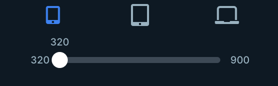
First, hover your mouse over the PC icon in. the header (next to the EYE icon) to reveal a chooser:
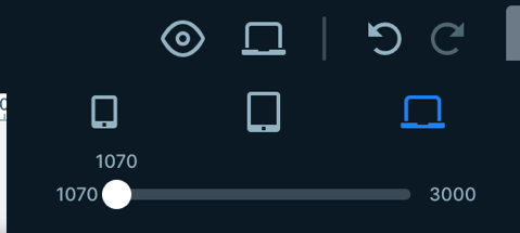
You will see three icons. A Mobile Device, A Tablet Device and a Laptop Device. The Laptop is the default view and this is what you see in the display. If you now click on the middle tablet icon, the screen changes to show what a Tablet use will see:

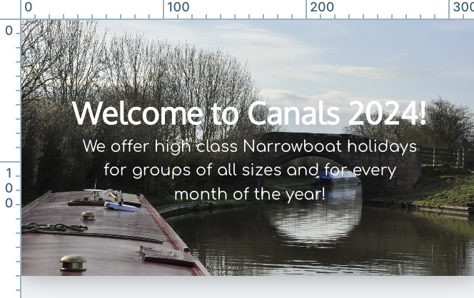
This is fairly ok but we might like to reduce the font sizes slightly so they are less overbearing in the tablet screen view (its all subjective!). To do this hover your mouse over the Heading block to see two A characters representing text sizes.
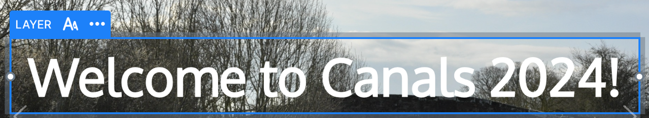
Click on the dual A icon to see a slider:
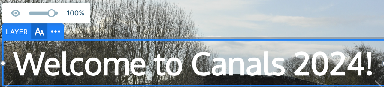
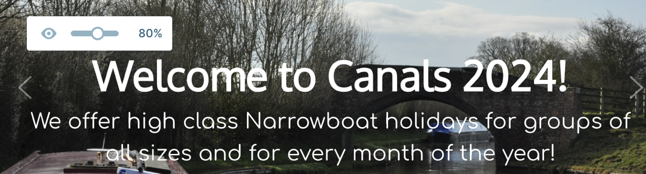
This tells us that at the moment, the text is 100% of the size set for the default heading size (54px). We can reduce this by sliding the slider to a lower value. We will choose 80%:
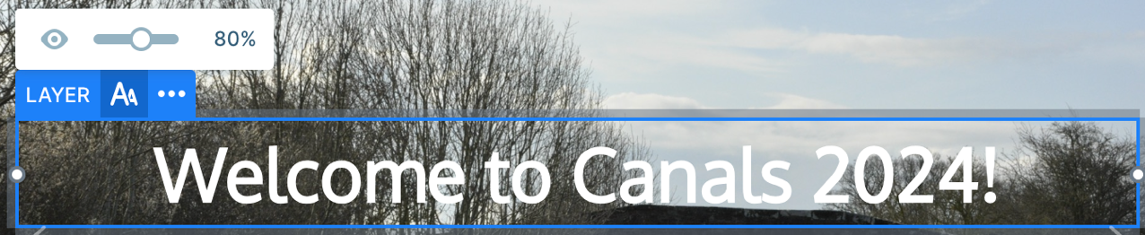
This is better!
We can now do the same for the subtext block.
We can also reduce the width for tablet views by adjusting the block width as we did earlier:

So now our tablet view is essentially a scaled down laptop view!
We now (and lastly) need to do the same for Mobile devices.
Click the responsive icon for Mobiles
Now perform the same font scaling as we did for the heading above, choosing suitable scale sizes for the heading block and sub text block when viewed in a mobile device.
We often find that a reduction in scale down to 40% is ideal!
Now SAVE your changes and use the EYE icon to preview your slider and you should find it looks great in all possible sizes and rotations!