The editor panel shows several tabs across the top. The most frequently used tabs are Content, Images and Links and Publishing. If there tabs that you don’t see on your site, you may ignore them.

6.3.1 The Content Tab
The Content tab holds the space where you add, edit, and remove text content (and other media as needed), to the article. The editor behaves a little like MS Word and you are provided with a toolbar or ribbon that holds several icons to allow you to work and style with your content.
Simply type your content into the editor panel. You can also paste content here from an external source such as MS Word but there are tricks and hints you will need to follow to be sure the text appears correctly on the website.
See our section later "Pasting Article Content" (Section 6.10).
6.3.2 The Editor Toolbar
The website editor which you see and use when editing an article offers a variety of styling features which allow you to change the look and feel of the text in a page so that it is more like a Microsoft Word appearance. Using these styling options can ensure consistency in terms of font face, colour, size etc.
Please note that using these features will not give you an exact 1:1 look and feel - that's pretty much impossible given the real complexity that Microsoft Word offers as an advanced word processing system.
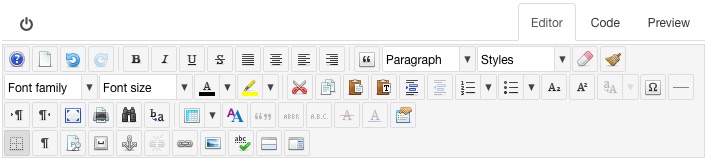
The above view of the editor toolbar shows the normally available choices that you can use when styling the content in your article. Note that each installation of a website may show slightly different icons in the toolbar.
Buttons in the toolbar have 3 states - Enabled, Disabled and Active.
Most buttons are Enabled by default appearing fully opaque. An enabled button can be clicked to execute its command or open an associated dialog box.
A Disabled button will not respond if clicked and appears as a semi-transparent version of the button. A button is disabled when the current action or cursor position is not relevant for that button, for example the Delete Table button:
will be disabled (greyed out):
when no table is selected or the cursor is not within a table. The same button will be enabled when the cursor is within a table.
An Active button indicates that the current selection in the editor content can be edited by the button’s function. For example when an existing link is selected the Link button :
becomes active:
When the button is clicked and the Link dialog box is opened, the properties of the selected link are shown in the relevant dialog fields such as URL or Title.
Once you have text in your article, you're now able to use the toolbar to select text and apply pre-set styles to it. Let's have a look at some of these now.