Creating a new EngageBox popup is a step by step process and if you follow them as below, you'll do well.
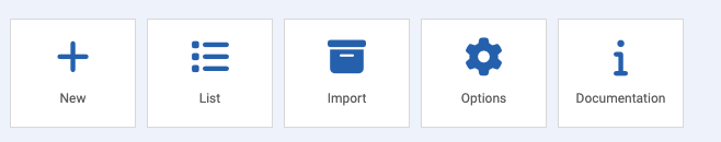
Click New
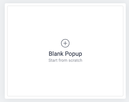
When you click New, the first you will see is the gallery of popup designs is presented. Most of the time you would use the Blank Popup (Start from Scratch) item by clicking the (+) icon:
This will now open a new, empty popup box showing the following:
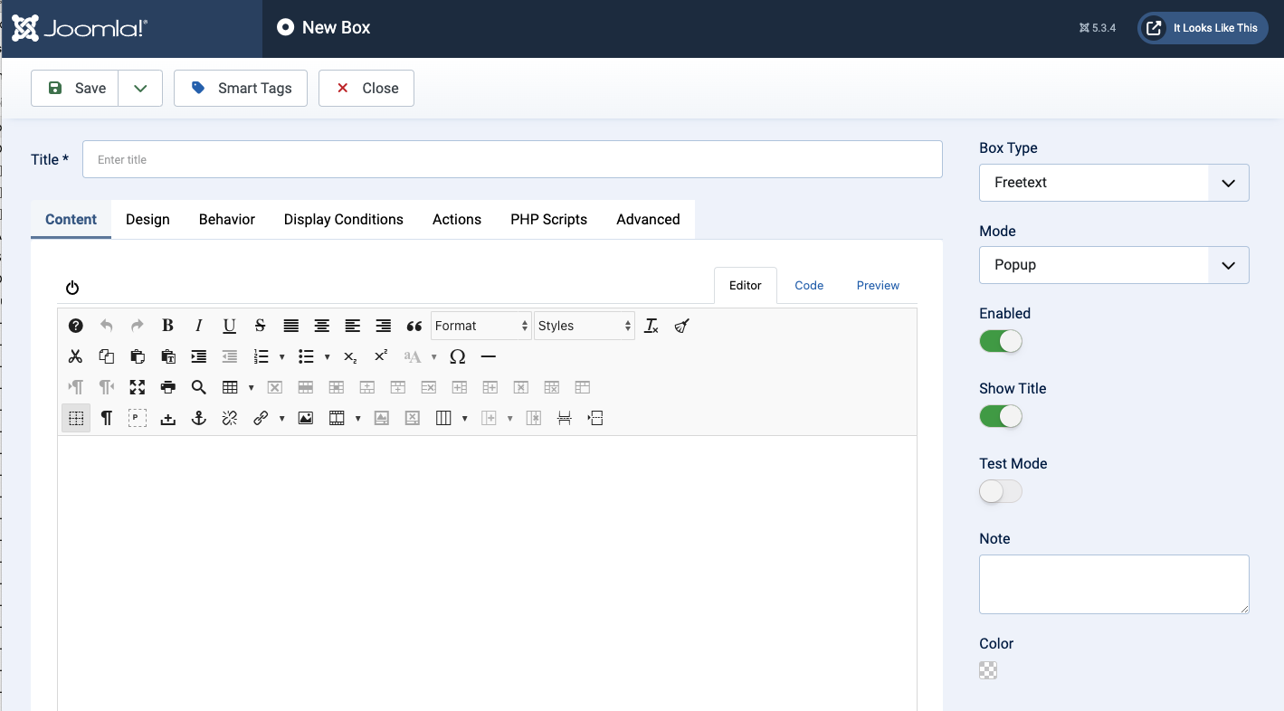
Let's look at these from top to bottom!
17.1.1 The Title field

Every EngageBox popup must have a title to at least indicate what the popup is about. Later you'll see that you can set the popup to NOT display the title which is a preferred feature as it allows you to give the popup a special title that does not show inside the popup itself.
17.1.2 The Editor Panel Options
Save
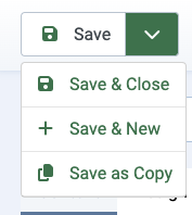
- The Save main choice will save the chnages you made to the popup.
- Save & Close will do as above and will return you to the list of popups.
- Save & New will do as above and will create a new empty popup for you to populate.
- Save & Close will do as above and will create a copy for you to edit and populate as needed.
Smart Tags
EngageBox knows about many system level 'values' that you can add to your popup. When you click Smart Tags, a page appears showing all available tags that you can copy and paste into your popup text.
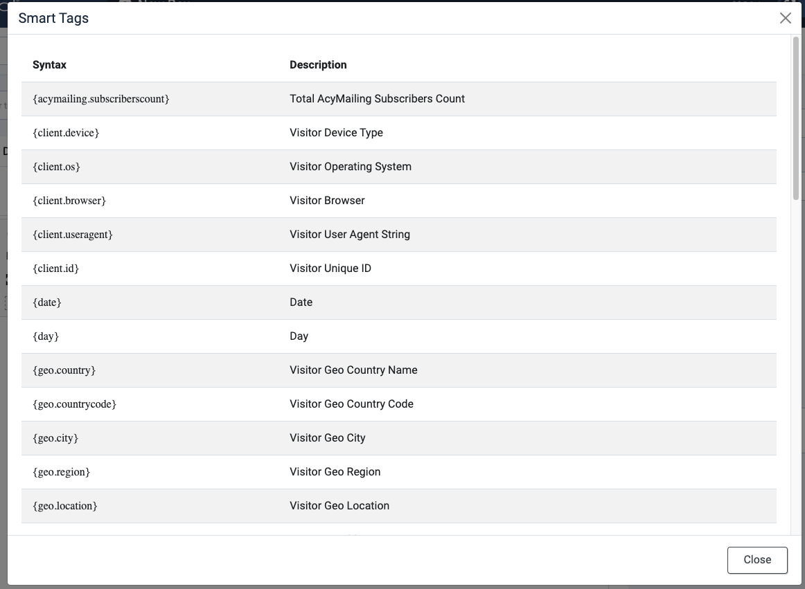
So, for example, if you wanted to add the current DATE into the popup text, you can hover your mouse over {date} to reveal a icon.
Click the icon to copy. the {date} code, a message will show all is well:

Now, you can paste the copied tag into your popup text.
Close
Clicking Close will close the popup editor so any changes made AFTER your last save will be lost. Rule of thumb? Only click CLOSE if you don't mind losing your edits, otherwise use Save & Close.
17.1.3 The Editor Tabs
The editor area has seven tabs to help you define and configure how your popup looks and behaves.

To reach other tab sections in this page, click the buttons below
The Content Tab
The content tab is where you will type or paste the text for your popup message. Its a bit like a Word page.
Caution though: I'd advise against adding too much text to the panel - it will take the page over if its too full!
You can add text, images and links (these are the most common content) to your popup so add what's needed to get the message across and keep it simple!
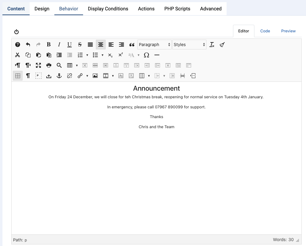
Once you have added the basic text for the popup, (you can add logos etc if needed - remember it works just like an Article so can support all types of content), we can move to the Design Tab.
Design Tab
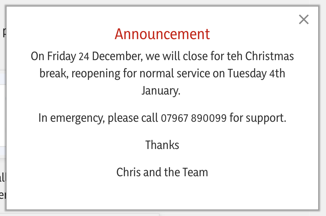
The design tab is used to define the appearance of the popup. As it stands, the popup would look like this:
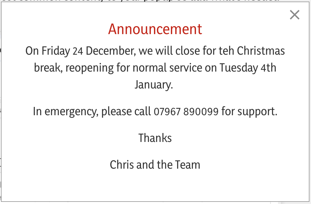
In fact its pretty good as it stands but the Options in the Design tab allow you to make it stand out more. Let's look at these choices:
Position
Defines where in the webpage the popup will appear. Normally this would be centred to the page, using this default setting:

But if you wanted the popup to appear in the bottom right of the page, you would use this setting:

Width
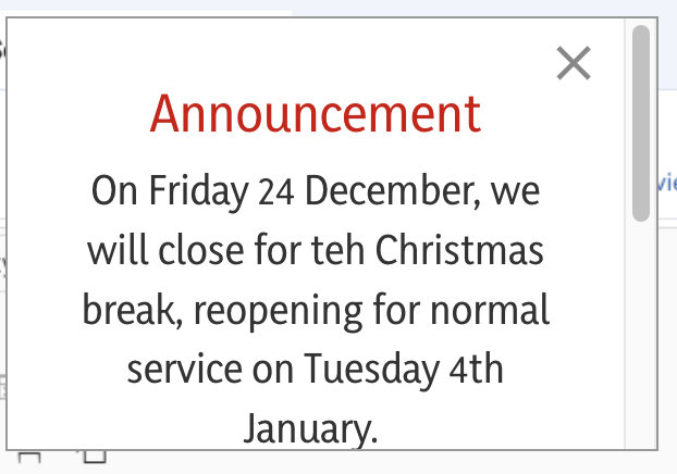
You can force the popup panel to be a set width by changing this value. The default is 500px (most current screens use 1384 pixels as their width so a 500px popup would consume just inder 1/3 of the screen width. If you needed a slimmer popup, you would reduce this to a lower value. So reducing to 300px, the popup would look as below:
The choice of width is entirely up to you. However, always bear in mind that if you make your pop-up thinner, then it will become taller based upon the amount of text it contains.
Height

The height value is normally set automatically and therefore you don't need to worry about it. If you do change it though, be aware that it will crop the text. For example, if I set the height to 200 pixels, the pop-up will look like this:
Notice the unattractive scroll bar on the right-hand side which visitors would need to use in order to see the full content. You can now understand why "Auto" is probably the most suitable setting!
Padding

The easiest way to describe padding is to use an analogy. Imagine a cardboard box. The cardboard box has a layer of eggs in it and the eggs are arranged such that they touch the sides of the box on the left and right and also on the top and bottom. There are no spaces between the eggs and the sides of the box. So, to protect the eggs, what we would do is we would use some form of padding to protect the eggs from the box sides. The same applies for boxes on a website. You can add padding around the content such that the content doesn't touch the size of the box that it sits inside.
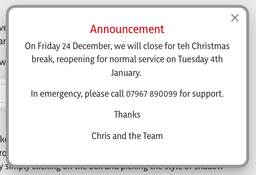
Here's an example of what our announcement box would look like if we set the padding value to zero for all of the four choices (top, right, bottom, left):

Notice how the text is jammed right against the left and right sides, and there is not much space above the red announcement text. It doesn't look very appealing to the eye; it looks rushed and unprofessional.
By applying some padding to these four values, we can ensure that the content has some nice space around it, between the sides of the box and its text inside it:
Margin
The margin is a little bit like padding but margins are on the outside of the box. Interesting, you can't actually see margins This is because they're pretty much invisible to the human eye. They create space between the outside of the box and other things which might be around it. In our case, we generally need to set the value of margins to zero for all four settings.

Locking the values together
In the cases of padding and margin, the four boxes can be set independently, so you can have different values for top, right, bottom, and left.
However, you will notice a padlock sits on the right-hand side of these choosers. If you click on the padlock such that it locks, as in the graphic above, then setting one of the values will automatically lock all of the other values in that row to the same value. If you need to set them independently, simply ensure the padlock is not locked by clicking it to open the padlock.
Text Colour
The text colour which appears in your popup by default is a very dark grey, indicated by the dark grey blob in the text colour chooser.

If you want to use a different colour for the text, click on the dark blob, this will show you a swatch that you can choose the new colour for yourself.
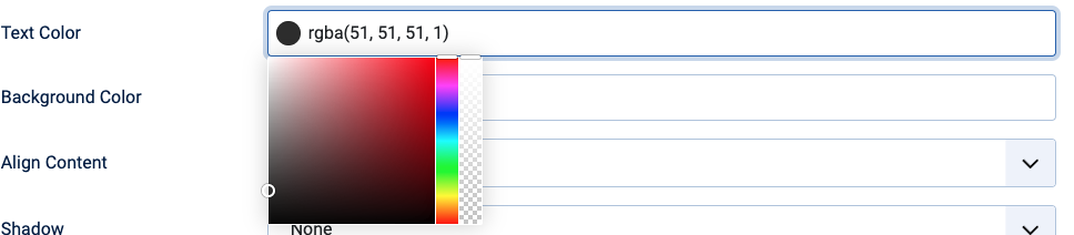
Your mouse up and down across the colour swatch to choose a new colour. When you've chosen your colour, its values will be seen in the text colour panel.
Background Colour
The background colour chooser allows you to define what the background colour will be for your pop-up.
By default, as you can see, it is a white colour. This is quite normal.

Remember that some people may have visual disabilities, and as such, having a good contrast between the background and the text colour is very important.
Align Content
Being able to align the content of a box in whichever direction you'd like is a great convenience. You can do that for your popup by clicking on Align Content and then choosing a direction.
The default setting of top left is normally best, however.

Shadow
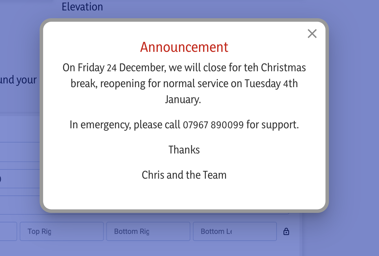
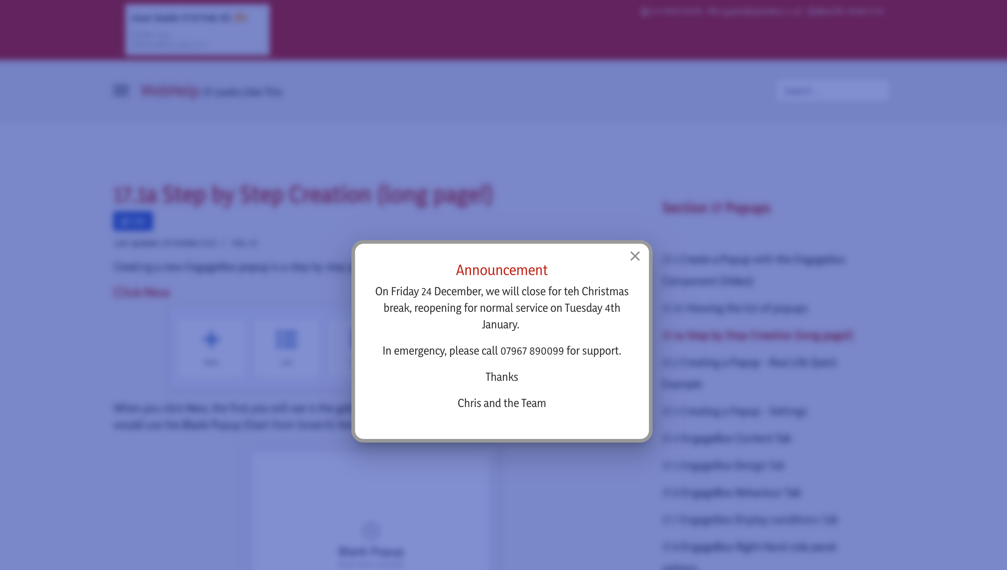
On its own, the pop-up box looks but you might like to make it more appealing and stand out a little by putting a shadow around the box itself. You are provided with four different styles of shadow: these are called style 1, 2, 3, and elevation. You can choose these by simply clicking on the box and picking the style of shadow which suits your eye best. Below are examples of what these four different shadow options look like.
 Style 1
 Style 2
 Style 3
 Elevation
Border
You may like to add a coloured border around your popup box to make it stand out even more - here are the settings, explained below:
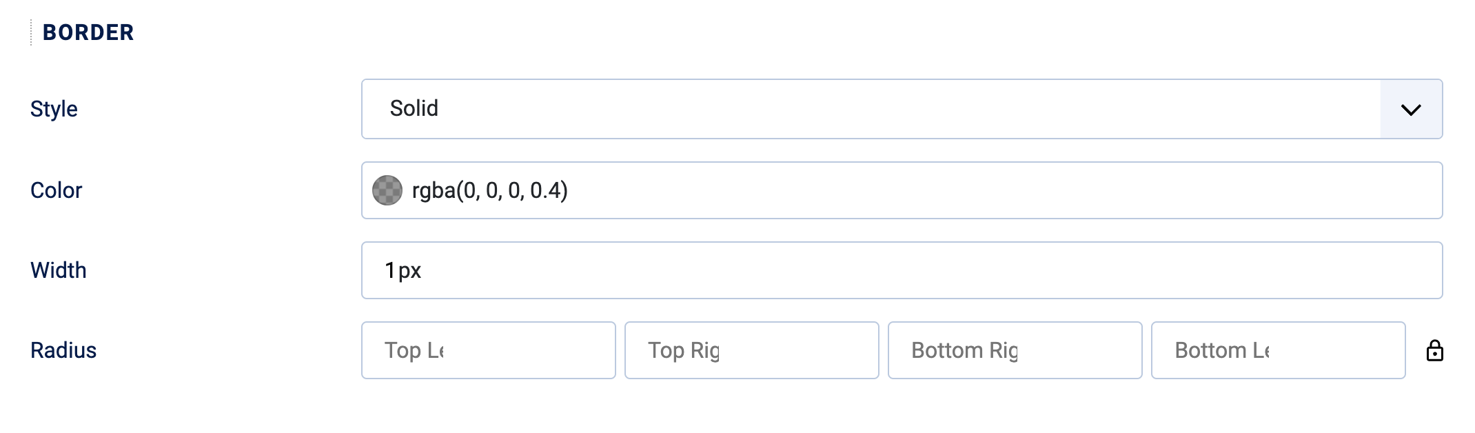
Style
The normal style used for a border is called "Solid", but you could also choose from several other styles such as dotted, dashed, double, inset, outset etc. These other styles might make your popup more busy thoough, so we suggest sticking to solid!
Colour
Choose a suitable colour for the border, clicking in the dark blob to see a swatch and choose from there.
Width
How thick do you want the border to be around the popup? Choose a setting between 1px and 10px. Anything greater thn 10px might look a little 'clunky'!
Radius
The corners of the margin around the popup can be radiiused to give a gentle curve to the overall appearnance. Normally all values for Top Left. Top Right, Bottom Right and Bottom Left will be the same (unless you want to make the box look different!). The example below uses a 20px radius all round:
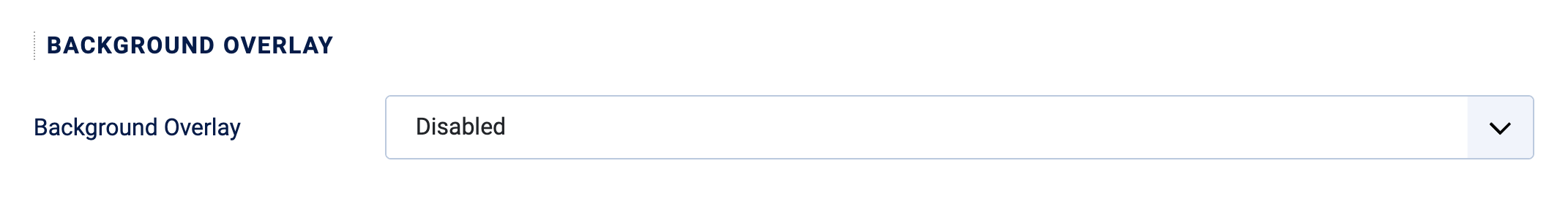
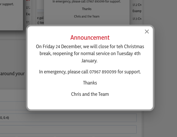
Background Overlay
EngageBox popups can have a translucent layer that covers the main content of your webpage when an popup is displayed. It sits behind the popup allowing you to make the popup more prominent.
Here's what it typically does:
-
Focuses Attention: It darkens or dims the background content, drawing the visitor's eye directly to the popup box, making it the central point of interaction.
-
Prevents Interaction: It often prevents the visitor from clicking or interacting with the page content behind the popup until they acknowledge or close the popup.
Customization
By default, the Background Overlay is disabled but if you wish to apply one to your popup, here are your options.
Enabled
When Enabled, you wil see a set of choices appear:
Color
Choose a suitable colour for the overlay, clicking in the dark blob to see a swatch and choose from there. You will notice that the default is rgba(0,0,0,0.5).
In easy terms, rgba(0,0,0,0.5) means: 50% Transparent Black
-
Color (0, 0, 0): When you mix 0 parts of Red, 0 parts of Green, and 0 parts of Blue, you get the color Black.
-
(If it were
255, 255, 255, it would be White.)
-
-
Alpha (0.5): This is the crucial part. It controls the transparency.
-
1.0 means fully opaque (you can't see through it at all).
-
0.0 means fully transparent (it's invisible).
-
0.5 means 50% opaque (or 50% transparent)—it's a see-through black.
-
So, when applied as a background overlay colour, rgba(0,0,0,0.5) will look like a smoky, semi-transparent black film placed over the content underneath. See example below:
Changing the color to (example) rgba(0, 22, 168, 0.5) (a shade or dark blue) will look like this:
Blur
The ability to apply a blur to the background overlay for a popup is a modern design feature that creates a cool, sophisticated visual effect.
In easy terms, it makes the content of your main webpage background for the popup look out-of-focus.
The Blur Effect: In addition to the colour outlined above, a blur filter is applied to the background behind the popup. This causes the text, images, and other elements of your main webpage to become indistinct, fuzzy, or blurry.
Why you use it:
-
Maximum Focus: By blurring the background, you completely eliminate any chance of the visitor getting distracted by the page content. Their eye is forced to stay on the clear, sharp content of the popup.
-
Modern Aesthetic: It's a very popular, clean, and modern look that gives the popup a feeling of depth and separation from the main page.
-
Visual Separation: It makes the popup feel like a distinct, prioritised element that is "floating" above the rest of the site, making the Call to Action or message feel more important.
In short, it's a stylistic choice that uses blur to enhance the contrast and focus on the popup message.
You set a blur value as a percentage in the background overlay settings, which defines the intensity of the blur effect.

This is what a 20% blur with a dark blue colour looks like:
Note how the background has a blue shade to it and is quite blurry, which makes the pop-up stand out even more.
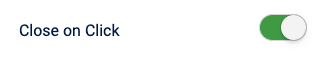
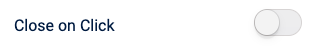
Close on Click
The default setting for this is ON.
It's a general rule of thumb that we want website visitors to acknowledge that they have read the detail of the pop-up, and so we expect them to click on the [X] in the top corner of the pop-up which will cause it to close (see later on Behaviour with relation to what happens when you close a pop-up).
There is the alternative which allows them to close the pop-up by clicking on the blurry background.
The problem with this, of course, is that it doesn't indicate that they have actually read the popup content, they are merely clicking the background to get rid of what's popped up. For this reason, we normally suggest that you set the Close on Click option as off.
 : ON
: ON
 : OFF
: OFF
Background Image
We don't use this feature, and therefore it's best left disabled.
Close Button
This is all about where the close button will appear, what it looks like, what its colour is, and how large it is:
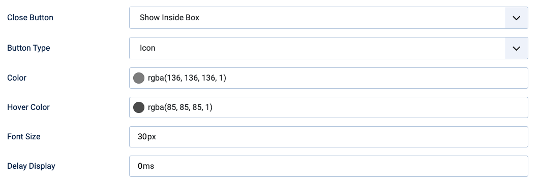
Default setting : Show Inside Box
This is the default setting and instructs the close button, normally shown as an X, to be shown inside the top right corner of the pop-up screen.
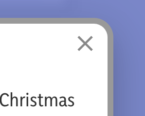
This choice is very definitely the highly recommended option. If you choose the option to show outside of the box, there is a good possibility that it will be missed by website visitors because it appears in the top right hand corner of the web screen.Therefore, we recommend leaving this setting as "Show inside box".
Button Type
Default setting : Icon
The option is provided by default as an icon. This is a preset icon delivered by the system which normally doesn't need to be changed.
However, possibilities exist for you to upload a graphic image to be used as a close button. Using this idea can detract from the appeal of the overall pop-up screen look and feel so we don't recommend it.
Color
Default setting : Vaire
Here, like above, you can choose the colour of the close button. Full stop. By default it's set to be a very dark grey with full opacity.If you want it to stand out more by making it a different colour, you can choose it as we have described several times above by clicking on the blob and choosing the appropriate colour.
Hover Color
Default setting : Varies
As above, if you want to change the colour of the icon so that when you hover your mouse over it, it changes to a different colour to make it more noticeable, you can change that colour in the same way.
Font size
Default setting : 30px
By default, because we are using an icon, the size of the icon is 30 pixels. This is a normal size and probably doesn't need to be changed, but if you want to make it a little bit larger or smaller, increase or decrease this number to suit your setting requirements.
Delay display
Default setting : 0
This relates to the amount of time in milliseconds that will elapse between the popup loading and the close button appearing. It's an interesting idea because you can set this value to be several seconds (milliseconds), and that will ensure that people can't close the pop-up until that time has elapsed. Setting this value for too many seconds, however, can be frustrating for website visitors.
Behaviour
The Behaviour tab is the system's configuration area which instructs the pop-up when to appear. What will happen when it appears and what will happen when it disappears. This section of the page looks into these settings in more detail.
Trigger
Default setting : Page Load
In EngageBox, a trigger is the specific action, event, or condition that you set to make a popup automatically appear on your visitor's screen.
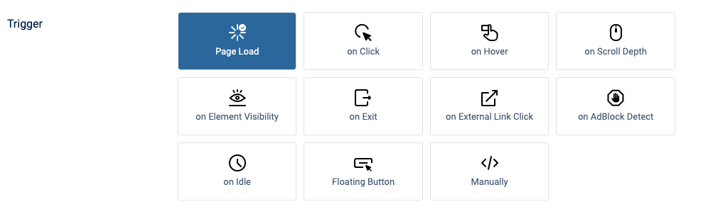
It's essentially the rule that tells the popup, "NOW is the time to show yourself."
You choose the trigger to ensure the right message appears at the best possible moment for conversion or engagement.
the default setting for the trigger is Page Load. what this means is that the pop-up will appear as soon as the page loads on their browser screen. several other very sophisticated methods can be used to cause a trigger event to occur. These are listed below but for simplicity we do not go into them in great detail in this guide as they are rarely used:
- On click : when a particular item or link is clicked, the pop-up will appear
- On hover : when an item or link on the web page is hovered over with the mouse, the pop-up will appear
- on scroll depth : when the website visitor scrolls down the web page by a certain percentage of the screen height, then the popup will appear
- Element visibility : when the website visitor scrolls down the webpage and a certain element comes into view, such as an image or a button or some other item, then the pop-up will appear.
- On exit : When the web visitor leaves a particular page and goes elsewhere, the pop-up will appear.
- On external link click: If a link to an external website has been set up with a particular class, then the pop-up will appear.
- AbBlock detect : when the visitor is detected as using an AdBlocker extension in their web browser then the pop-up will appear.
- On idle: if the website visitor is on a web page and doesn't do anything in terms of clicking or scrolling for a certain number of seconds, then the pop-up will appear
- Floating Button : a floating button can be created to appear in an area of the web page, for example, in the bottom right, which is configurable and will make the pop-up appear when the button is clicked
- Manual : the Manual trigger is a trigger that prevents the popup from being displayed automatically based on any visitor behaviour or page event
Early Trigger
Default setting : Off
Normally, a pop-up will appear when everything related to a web page has loaded into the visitor's browser. there may be rare occasions, however, when you want the pop-up to appear before anything else appears, or at least earlier than normal. You can use the early trigger feature to do so. You cannot define how early this happens
Delay
Default setting: 0
You can set a delay on when the pop-up appears. As noted above, the pop-up will appear immediately after all parts of the web page in question have loaded. However, you can set a delay in milliseconds to instruct the pop-up to appear later than normal.
Floating Button : Show on Close
Default setting: Off
When the visitor closes the popup, You can activate a button which can appear in a predefined location on the web page, which allows them to click and then reveal the popup again.
Opening Behaviour
Limit impressions
Default setting: Off
Play sound effects
Default setting: Off
This setting is not used and we don't recommend it. If it is used, then the resultant pop-up behaviour can be unpredictable because it needs very fine tuning and specialist skills and knowledge of how cookies work, and how user behaviour with respect to sound is perceived.
Accessibility
This is a useful feature if you have clickable links in your pop-up.
Auto-focus
Default setting: Off
You can activate this feature if you wish, doing so will make the website's visitors' cursor automatically select the first link in the pop-up. For example, if there are two clickable links in the pop-up, one which goes to BBC and the other one which goes to Google, if you activate autofocus, then the BBC link will be automatically selected and ready for use without the visitor having to move their mouse over that button (particularly relevant for desktop use as opposed to mobile use).
Close with ESC Key
Default setting: Off
From an accessibility standpoint, having the ability to close a pop-up by clicking the escape key on the keyboard is often very helpful, stop. This is particularly relevant where the website visitor has accessibility issues, meaning that their capability to use a mouse accurately is limited, full stop.
Using the escape key is the alternative to closing the pop-up.
Animation
Subtle use of animation for the pop-up can enhance its appearance. However, care should be taken not to go to extremes!
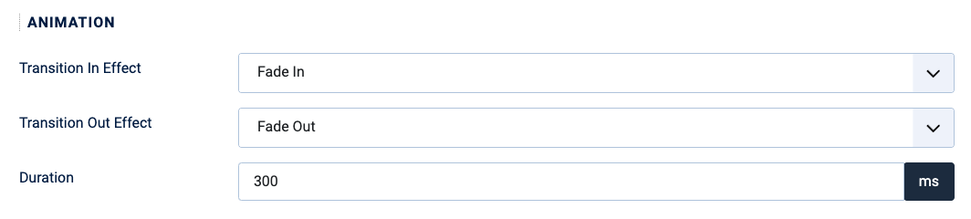
The transition in and transition out effects by default are the fade in and fade out option.These are quite common and, in our experience, are ideal choices because they are unobtrusive but effective at the same time.
The duration feature instructs the pop-up how quickly to perform the animation. The default of 300 milliseconds again is common and ideal.
Display Conditions
The Display Conditions tab in an EngageBox popup setting allows you to specify when (time/date) and where (based on a menu choice) your popups should be shown or hidden. It gives you precise control over the targeting of your popups to ensure they are seen by the most relevant audience under specific scenarios.
Look at the default settings shown below, where you'll see that the display pop-up is configured to appear on all pages of your website. This is generally undesirable, as you might expect full stop, and therefore the other two choices give you further freedom, but let's explore all three:
On all pages
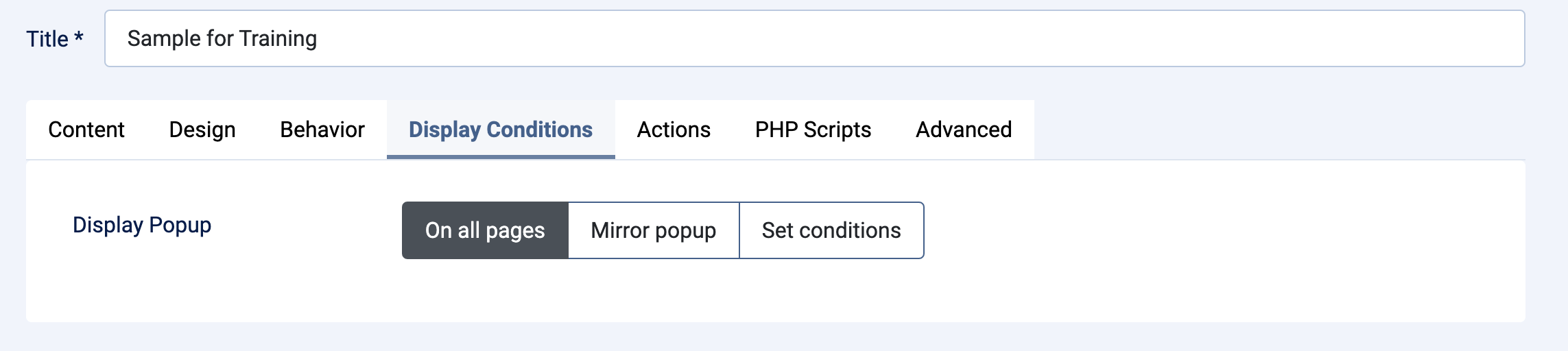
If you leave the default setting as "On All Pages" then what will happen is that the pop-up you create will appear on every single page of our website when the page loads. You can imagine how inconvenient this will be for your website visitors! It's for this reason, you have the option to set the conditions to tell the popup to only appear on one page.
Mirror popup
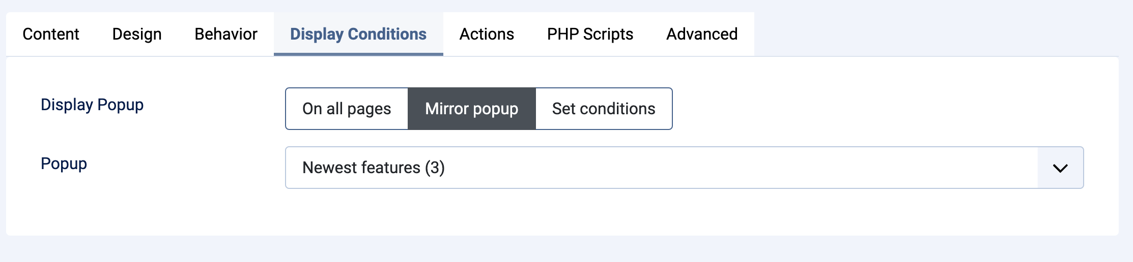
Mirror popup is a time-saving feature that allows you to copy all the display conditions from one already existing popup to your new one. When you choose this option, you will be shown a chooser from which you can pick the existing pop-up that you want to mirror.
In simple terms, selecting the "Mirror popup" method means:
-
Duplication of Rules: The popup you are currently editing will adopt the exact same set of display conditions as the source popup you choose to mirror.
-
Efficiency: Instead of manually configuring a complex set of conditions for a new popup, you can instantly apply a proven set of conditions from a popup you've already configured.
This is a very useful option when you want to create multiple popups (perhaps with different content or designs) but that must appear on the exact same pages.
Set Conditions
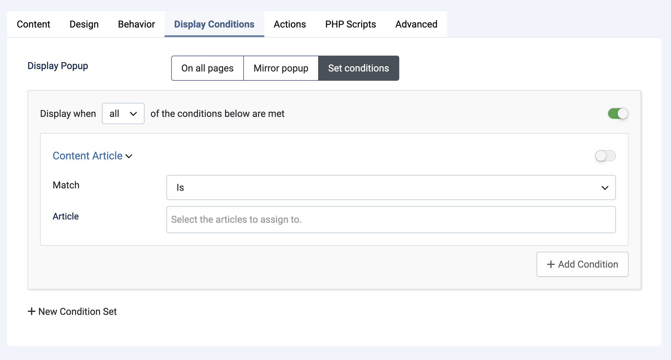
The set conditions option is very powerful and allows you to dictate when the pop-up appears and what will be the condition which makes it appear
The available conditions are extensive and cover various categories, including the following most common choices:
Page or Content-Based Conditions:
- URL Condition: Displaying or hiding a popup based on the visitor's current URL.
- Homepage: Targeting the homepage specifically.
- Joomla! Content Conditions: Targeting by article, category, or component view.
Time/Date-Based Conditions:
- Date Condition: Targeting a specific date.
- Time Range: Targeting a specific time of day.
- Day of Week/Month: Targeting specific days or months.
Less common options for conditions are also available and listed below:
User/Device-Based Conditions:
- Operating System: Targeting by the visitor's operating system (i.e a popup specific to the user's devise OS - Windows, MACOS, IOS, Android etc.)
Visitor Behavior/History Conditions:
- New/Returning Visitor Condition: Targeting first-time visitors versus those who have been to the website before.
- Pageviews Condition: Requiring a minimum number of pageviews before the popup appears.
- Time on Site: Requiring a minimum time spent on the site.
- EngageBox - Viewed Another Popup Condition: Showing or hiding based on whether the visitor has seen a different popup.
Geolocation/Technical Conditions:
- Country/Region/City: Targeting visitors based on their physical location.
- IP Address Condition: Targeting specific IP addresses.
- Cookie Condition: Targeting based on the presence or value of a cookie.
- PHP Condition: Using custom PHP to define a display condition.
These conditions allow you to create sophisticated targeting rules, often combining multiple display rules to get a precise result, to ensure the right message is shown to the right person at the right time.
The above list offers many sophisticated choices that will dictate where and when a popup can occur but in day to day use, we find the most common choices are Page or Content based and sometimes, Time/Date based conditions.
We use these two choices in the details below. If you need to explore the alternative choices, call for support.
Choosing the right Conditions
When you click on the set conditions, the page expands to show the options available:
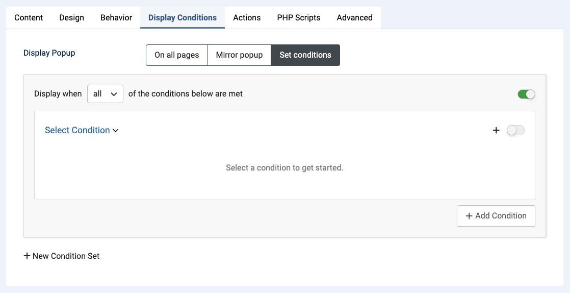
You are invited to select a condition to get started.
When you click on the Select Condition Pulldown Chooser, a drop-down appears.
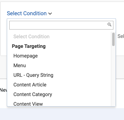
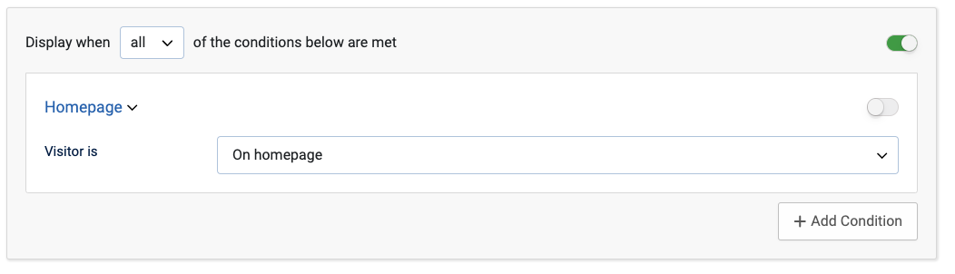
The most common choice will be to allow your pop-up to appear on the home page of your website, and so you could simply choose Homepage from the options available:
.