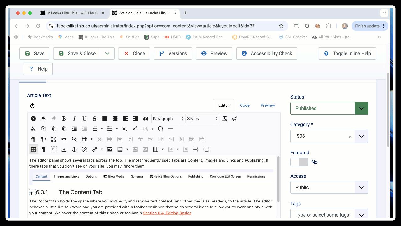
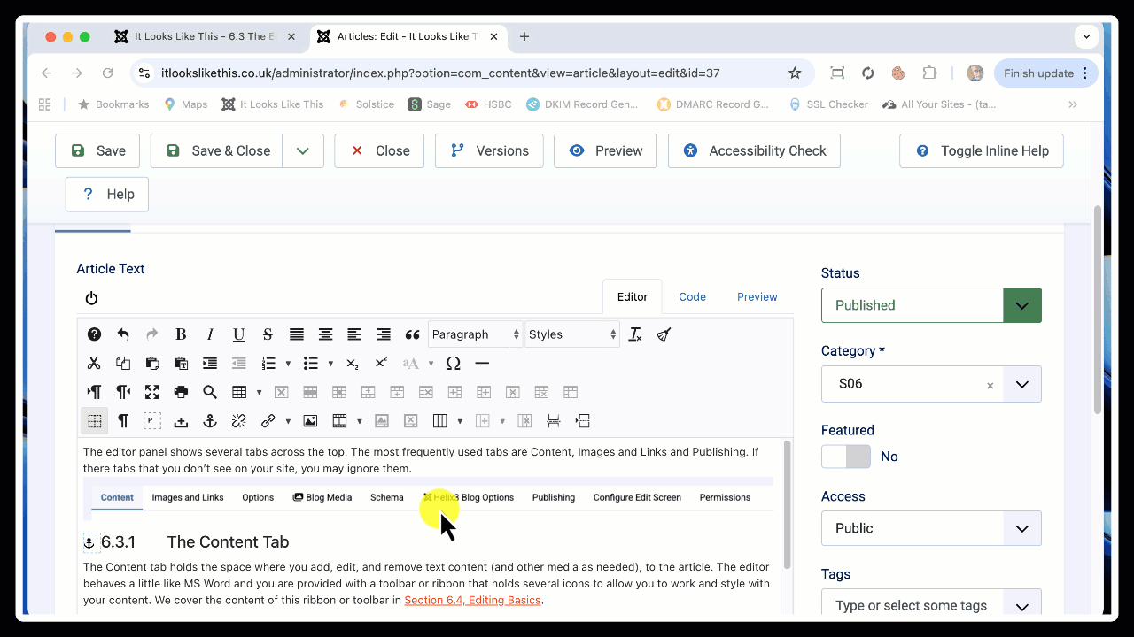
The editor panel shows several tabs across the top. The most frequently used tabs are Content, Images and Links and Publishing. If there tabs that you don’t see on your site, you may ignore them.
The Content Tab
The Content tab holds the space where you add, edit, and remove text content (and other media as needed), to the article. The editor behaves a little like MS Word and you are provided with a toolbar or ribbon that holds several icons to allow you to work and style with your content. We cover the content of this ribbon or toolbar in Section 6.4, Editing Basics.
Simply type your content into the editor panel. You can also paste content here from an external source such as MS Word but there are tricks and hints you will need to follow to be sure the text appears correctly on the website.
The Editor Toolbar
Looking at the editor toolbar, the first thing you may notice is an on-off switch (sometimes it will read HTML instead) on the left-hand side and three tabs on the right. Here's a quick overview of what these are for:
The on/off (or HTML) switch: This is often changed to read "HTML" to make things easy for you to understand. When you click on this icon or the text which reads HTML, it will set your editor into pure HTML view. In 99% of editing cases you will never need to use this view, as this is quite complex and expects you to understand what HTML is all about. You can click this item on and off to change between HTML and standard editor view. The animation below shows this in action:
Editor tab : This should be your default editing view, allowing you to type or paste text in and style it and format it in the most appropriate way using tools which are described in more detail below.
Code tab : This tab gives an almost identical view to if you had clicked on the on/off switch/HTML icon. The difference is that with the code tab, HTML code is shown in highlighted sections with different colours which reflect the different elements of your HTML. Again, we wouldn't expect you to ever need to use this particular code tab unless you have a specific need to inspect or edit the HTML code.
Preview tab : When you click the preview cat tab, you'll be offered a view of your web page in terms of generic layout. Notice this will not reflect exactly what your page will look like when it's viewed in the front of the website. It's purely for a general look and feel idea.
The animation below shows these three tabs in use and what happens when you click each of them:
The website editor which you see and use when editing an article offers a variety of styling features which allow you to change the look and feel of the text in a page so that it is more like a Microsoft Word appearance. Using these styling options can ensure consistency in terms of font face, colour, size etc.
Please note that using these features will not give you an exact 1:1 look and feel - that's pretty much impossible given the real complexity that Microsoft Word offers as an advanced word processing system.
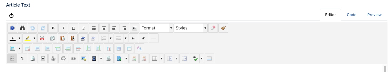
The above view of the editor toolbar shows the standard available choices that you can use when styling the content in your article. Note that your installation may show slightly different icons in the toolbar.
Button States
Buttons in the toolbar have 3 states - Enabled, Disabled and Active.
Most buttons are Enabled by default appearing fully opaque - this means those buttons are active and ready to be used.
An enabled button can be clicked to execute its command or open an associated dialog box.
A Disabled button will not respond if clicked and appears as a part-transparent version of the button. A button is disabled when the current action or cursor position is not possible for that button, for example the Delete Table button:
will be disabled (greyed out):
when no table is selected or the cursor is not within a table. The same button will be enabled when the cursor is within a table.
An Active button indicates that the current selection in the editor content can be edited by the button’s function. For example when an existing link is selected the Link button :
becomes active:
When the button is clicked and the Link dialog box (a dialogue box is a pop-up window which appears once a button is clicked in the editor) is opened, the properties of the selected link are shown in the relevant dialog fields such as URL or Title.
Once you have text in your article, you're now able to use the toolbar to select text and apply pre-set styles to it. Take a look at the Editing Basics page for a start!