When you add documents to an article using Dropfiles, there are sometimes unusual things happen in terms of what they look like on the front-end. This page describes what you might see, why it looks like it does and then how to fix it.
8.9.1 The normal view of documents
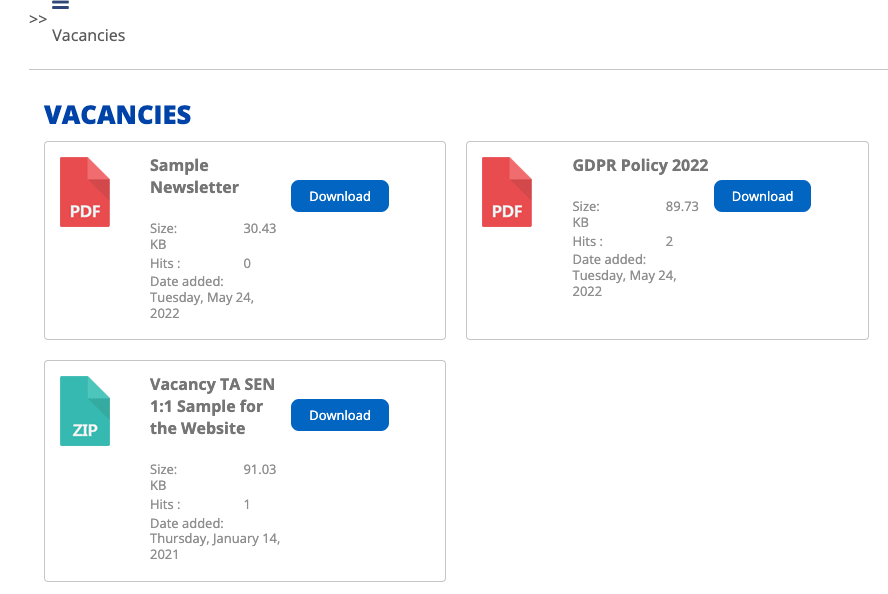
Normally, documents on the webpage will look like the example below:

Or…

These views of documents (where you see single coloured panel with the file name and a download button or maybe an icon representing a PDF, the title of the document and then over on the right, a coloured Download button) is created by using the “Simplex” or "Table" theme settings for the Category/Folder in question.
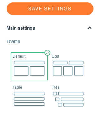
As you'll see earlier, the category or folder theme is set against the folder by choosing the Simplex or Table icon on the right-hand column:
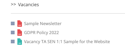
However, if you create a new category/ folder within Dropfiles and you forget to set the theme to Simplex or Table in the right-hand column for the selected folder, then when you look on the front end at your documents they will look something like this:

This is because you failed to set the theme correctly and if you actually look at your folder settings in the right-hand column for the folder in question, you will indeed see that the default theme has been set for you:

So to fix this particular issue, simply head to Components > Dropfiles, look for the folder in the left-hand column which contains the files which are being displayed incorrectly, select the folder by clicking it - this will highlight it:
![]()
Then, look in the left-hand column to see how the theme is set. Simply click on the Simplex or Table icon/ image. You do not need to press the Save button, that's done for you when you change the theme.
8.9.2 Other views that you might see
You will notice that there are up to six themes available. When you first create a new category/ folder, it will automatically be set with the Default theme as shown above. You will now understand that we recommend that you always choose the Simplex or Table theme for the most appropriate view of your files on your webpage.
If you inadvertently (or deliberately!) set the theme to one of the other options such as GGD ( which is short for Google Grid Documents) or. Tree, then the view will look like this:
 GDD View
 Tree View
8.9.3 Can I use these non-standard Views?
Of course you can, your website and you can use whatever view you feel is appropriate. Simply bear in mind that the view that you choose may have an impact on how the outside world are able to access your downloads.
8.9.4 Help! I'm seeing a completely different view to what I expect!
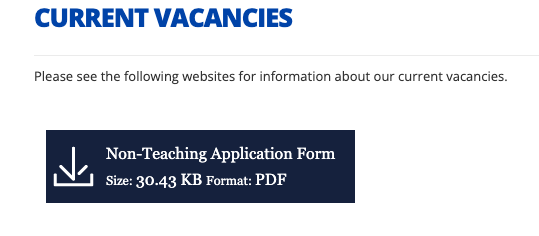
If you look at a webpage having added Dropfiles to it and instead of the red PDF icon, title and download button being seen (as shown earlier), you see a rectangle with an unusual icon and text ( see the example below), there is a good reason for it!

What you are seeing is the Single File view method of displaying files. What this means is that when you uploaded your files into a Category/ Folder inside Dropfiles, what you then did was you selected the file that you uploaded and clicked on the " Insert This File" button in the top right-hand column.

In other words, when you have files in a folder, you should use the Insert This Category button to force all the files in the folder to be displayed.
8.9.5 The Workaround
Given that it's not possible to show a stand-alone file ( which sits amongst a bunch of other files in a folder) in a more appealing way, we have a workaround which isn't difficult to achieve which will allow you to show the standalone file so it looks as if it belongs to a group of other files. We do this by creating a new category/ folder inside dropfiles and then we select the file in question in its original folder and we configure it to have a Multi-Category setting so that it also appears in your newly created folder. Here are the steps:
- Within Dropfiles, create a new Category/Folder. This folder will be added to the bottom of the list of folders on the left-hand column and will be titled "New Category".
- Hover your mouse over this new folder to see the Pen icon and edit the name so that it is relevant to your standalone file ( something sensible that you will be able to refer to easily), example Standalone Safeguard File
- If you need to, drag and drop this new folder up the list of other folders so it is easier to find.
- Now, find the file you want to show as a stand-alone file, do this by using the Search facility or simply navigate into the folder where it sits and select it
- With the file selected, look in the right-hand column at the properties for the file and scroll down that: until you reach the Multi- Category field.
- Click into this field and start typing the name of the new folder you created in (2) above [Standalone Safeguard File]
- As you type the folder name will appear. Click it to select it so that it appears in the box.
- Scroll up or down in this column and click on the Save button.
- Now, click onto the folder that you created [Standalone Safeguard File]
- You will notice that the file that you set as Multi-Category is now appearing in this folder
- Now that you have created a link to the file you wish to be displayed in a stand-alone fashion, and it lives now in a folder on its own, you can now edit an article and at the place where you wish to show this standalone file you can use the Files - Dropfiles button at the bottom of the editor screen, select the folder Standalone Safeguard File, and use the button at the top of the right-hand column labelled. "Insert this Category".
- This will insert the category that only holds one file that you chose into your article.
When you save the article and look at it in the front-end you will notice that it displays the stand-alone file that you created as a clone (Multi-Category), in the appropriate way.
This is a workaround that works very well. We really don't recommend using stand-alone files using the Insert this File mode of Dropfiles, but if you have to do it then the workaround makes things look much more attractive!