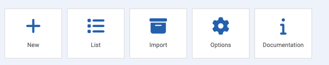
Whenever a new popup is created it will be added to the EngageBox list which is reached by navigating to Components > EngageBox > List by clicking on the list icon in the EngageBox control panel.
In the list you will notice that the name of the box is a clickable link, doing so will put the box into edit mode where you can fine tune it content and other settings.
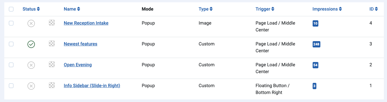
Column Headings
Status
When the list is displayed it will show you the status of the popup. A green tick indicates that the popup is live. A grey cross indicates that the popup is disabled.
Name
Quite simply, this is the name of the popup itself.
Mode
Tells you whether or not the box is a popup or a page slide mode.
Type
Indicates whether or not the pop up you have created is custom from a Blank or is from a template.
Trigger
This column indicates to you what has been set as the trigger for the popup to appear and also where on the page it will appear.
Impressions
Impressions relates to the number of time that the pop-up has been seen by visitors.
ID
The unique identifier for the popup item